I wonder if you can help.
# create the baseline (on which the for example a model is fitted form which one can sample and derive the uncertainity of the cycle)

    x <- "
Groups  5Y(average) 2016    2017    2018    2019    2020
1   26  21  23  26  28  31
2   21  20  21  22  22  22
3   26  28  28  27  26  24
4   17  19  18  16  15  15
5   7   9   8   7   6   5
6   2   2   2   1   1   1
7   1   0   1   0   1   1
8   1   1   1   0   0   0
"

data <- read.table(
    textConnection(object = x),
    header = TRUE,
    sep = "",
    stringsAsFactors = FALSE
)
data

ccf.list <- list()
for(i in 1:nrow(data)){
    ccf.res <- ccf(ts(data)[i,],ts(rev(data))[i,])
    ccf.list[[i]] <- data.frame(group=i, lag=ccf.res$lag, ccf=ccf.res$acf)
}

cycl <- do.call(rbind, ccf.list)
cycl

q.cycle <- do.call(data.frame, with(cycl[ ,c("lag","ccf")], aggregate(cycl[ ,c("lag","ccf")], list(lag), quantile)))
q.cycle
q.cycle.short <- q.cycle[ ,c(1,c(7:ncol(q.cycle)))] # pick up teh 75% percentile as the baseline as the curve seems to fit the best (full down and up cycle)

# to long format for plotting all percentiles
q.cycle.long <- data.frame(lag=matrix(as.matrix(q.cycle.short[1]), ncol=1), ccf=matrix(as.matrix(q.cycle.short[-1]), ncol=1))
q.cycle.long$year <- with(q.cycle.long, rep(1:11,nrow(q.cycle.long)/11))
tail(q.cycle.long)

plot(ccf.75. ~ 1, data=q.cycle.short, col="red", type="b", pch=19, lwd=3, ylim=c(-0.5,0.5))
lines(ccf ~ year, data=q.cycle.long, col="darkgray")
abline(h=0, col="blue", lwd=3, lty=3)
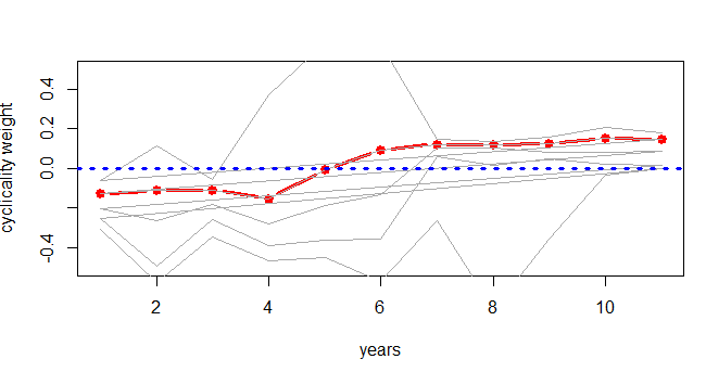
Here this would be possible if a parametric model would exist and just new.data=data.frame(years=1:10) would allow to extrapolate. But how to get there sensibly?
Below you find very simple attempt which based on first inspection seems to be plausible but there must be better (and correct) way to estimate it.
Sample data and the attempt (in r):
The data are percentages per group and represent the proportion of observations per group of the overall dataset per year (each column should sum to 100% or 1, but because of rounding some might be slightly over 100%). The below data contains 5Y of data and its collected once a year (end of year) and this sample (patients in given category) shifts across these groups. (due to health risk).
This current data represents currently lower cycle with lower health risk. The cyclicality is expected due to exogenous factors and have roughly (length of upper or down cycle between 5-10 years. Unfortunately there is limited data on this migration and its expected (assumed) that the current down cycle its just reverse to explain how the upper cycle looks like (just a mirror).
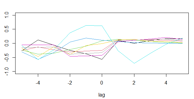
The graph below is derived form this code:
plot(ccf ~ lag, data=cycl[cycl$group==1, ], col=1, type="l", ylim=c(-1,1))
with(cycl, by(cycl, group, function(x) lines(ccf ~ lag, data=x, col=group)))